An album cover art story
“We’ve got to have this guy on board. He’s fucking mad!”
The speaker was Roger Waters, sharing his enthusiasm with band mate Nick Mason after watching Long Drawn-Out Trip, an animated take on American society by British cartoonist Gerald Scarfe. The year was 1971, and Pink Floyd was yet to become a house hold name. The iconic album covers that linked their name with visuals such as a prism, a man in flames shaking hands and a floating pink pig, were all in the future. But the connection with the political cartoonist was created then, and it culminated eight years later with one of the grandest visuals associated with any rock act in history – The Wall.

Scarfe grew up a sickly child, troubled by chronic asthma: “I spent a lot of time in hospital, and in bed I had nothing much to do except draw and read, and drawing became my way of expressing myself, getting my thoughts and fears down on paper. And I suppose that’s what I’m still doing: drawing things that I fear.” His view of the world and the folks that inhabit it was formed by the experiences he had with the harsh medical staff of the day: “I think I very much mistrust authority, and I think that comes from relying on doctors. I’ve had some dodgy treatment. There was an osteopath who used to rabbit punch me on the back of the neck because he thought my vertebrae were out of line.” Another incident involved a male nurse who hosed him with cold water “as though I was being sliced by an open razor as the laser-like jet traced down my back on to my buttocks.” No wonder then that he developed a mistrust towards people in general, and as he grew up, focusing it on politicians.
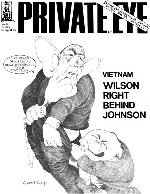
Scarfe started his career as a political cartoonist in the 1960s, working for satirical magazines such as Private Eye and Punch and later contributing his caricatures to more established publications including the Daily Mail, the Sunday Times and Time Magazine. One of his famous drawings was of an aging Winston Churchill, a portrait of the once-symbol of English strength and perseverance. Scarfe said: “I was asked to do it and sat in the House drawing, but what I saw was a senile and shambling old wreck, not the bulldog politician.” The unbecoming drawing was rejected by the Sunday Times, the newspaper fearing that Churchill’s wife Clemmie will be offended. Private Eye had no such concerns and featured it on its cover.

In 1966 Scarfe was sent by the Daily Mail to Vietnam. The paper, who had no idea what to do with Scarfe, thought “a cruel, grotesque artist, let’s send him to a cruel, grotesque situation.” Scarfe had only seen war on television up until then, and this was his first live experience of it. Even for the extremely blunt cartoonist, Vietnam was more grotesque than any of his drawings: “I had great difficulty in Vietnam really, drawing it, I found it too much to stand, the blood and guts of it all, and the incompetence of it all and the sort of stupidity of it all. I went into the morgue in Saigon. I went in there and I was just shocked by what I saw, because it hadn’t struck me that there’d be bits of bodies, heads without torsos and torsos without heads and torsos without limbs. Some were just like lumps of meat, and they were all being cleaned up by American medics. Some of them were whistling, because to them it was just a job, they were whistling and doing a daily job, in their white coats spattered with blood.”

Scarfe admits that he was not a Pink Floyd fan at the time Mason and Waters contacted him, he just heard of them. They were working on a new album initially titled Eclipse, then renamed Dark Side of the Moon – A Piece for Assorted Lunatics. Scarfe went to see the show and came out a converted man: “When I first worked with Pink Floyd I was puzzled by their music. It was Dark Side of the Moon at that time. They invited me to The Rainbow in Finsbury Park where they were performing and I found it theatrically very thrilling.” The visual potential was as striking to him as the music, soon to be released as the band’s career-changing album The Dark Side of the Moon. The band first hired him to add his cartoons to the comic tour book that accompanied their 1974 tour of the album. Not many rock stars would have approved of a portrait of them like the one below from the booklet, but by then Pink Floyd, and Waters in particular, started to develop their cynical view of the world, resulting from constant touring in front of large audiences.

The collaboration between Scarfe and Pink Floyd continued with their 1977 In the Flesh tour that followed the release of the album Animals. This time he created a number of video segments that accompanied some of the songs they performed on that tour: “I couldn’t really come to terms with what they were doing, it seemed sort of celestial and floating music. So I added a lot of figures falling through space turning into this and turning into that, crashing through in a very surreal way. I said to Roger, ‘we can’t just lace film into anywhere you like – it’s got to match’. But he had this theory that if you put a piece of music alongside an image, the brain will find a way of making a connection.” Here is the clip he created as the backdrop to the live performance of Welcome to the Machine:
Scarfe acknowledged the fact that his early work with Pink Floyd, while enhancing the music quite vividly with images and animations, did not represent what he does best: satire: “I was known in Britain and parts of America for making fun of society and poking fun at politicians. I think that is what Roger and Nick needed from me at the time. I didn’t quite get that and I started to make them these surreal images of men tumbling through the stratosphere and crashing through the sky. They were all rather surreal. I think what they were expecting from me was probably something a little more actual about the world itself in a more precise way.” That all changed with his next project with the band, one that continues to be staged and screened for decades later.

Scarfe remembers the first time he listened to the songs from The Wall, very early in the life of that album: “Roger came and said, ‘I’ve just written this thing, The Wall,’ and he wanted to play me these raw tapes. So he found a synthesizer and put it all onto tape, and he came to my studio in Chelsea here in London and played them to me. And it was kind of an awkward moment when he finished, because, what do you say when someone just plays their whole life out to you? And I didn’t have anything adequate to say. I said, ‘Oh, well, yeah. Well, you know. That’s great!’. And then there was a kind of awkward silence, and Roger says, ‘You know, I feel as though I’ve pulled my pants down and shit in front of you.’”

Scarfe was tasked with a visual project that would keep him busy for the next few years. While his immediate focus was the album cover, he knew from the onset that that this is a true multimedia project: “Roger said at that time, ‘We’re going to make a film, we’re going to make a record, and we’re going to make a show out of it.’ Which, to his credit, all three happened.” Finding the appropriate visuals to depict the main characters in the story line proved to be his biggest challenge. The right side of the LP inner gatefold has all of them drawn in Scarfe’s well established style of grotesque political cartooning: The mother, the school teacher, the girl friend, the judge.

That last character was at the bottom of the list, respect-wise, and literally: “First of all my experiences of judges are that the ministry of the law is a tricky business and they always make mistakes, so to me the law was an asshole, so that was that.” The characters would have a shelf life well beyond the expectations of their creator, due to their use as 30-foot puppets in live shows by Pink Floyd and Roger Waters over the years.

Another iconic visual that was introduced in the album’s inner gatefold was the marching hammers. Waters’ narrative included WW2, fighting Nazism, assemblies of fascism, vulgar expressions of racism, and other bad isms sprinkled throughout. Scarfe needed a face for the evils of the world, and found it in the toolbox: “When it came to something like the forces of oppression that we were trying to do, I invented, I designed the hammers. They just came into my head one day as the most unrelenting, cruel piece of machinery — a vicious hammer. The hammer is a force of oppression, a fascist force, controlling, and very, very hard. Naturally I thought, what’s the implement and the object that is the most unforgiving and brutal, and a hammer came to mind.”

The teacher did not fare much better than the judge under Scarfe’s unrelenting pen and ink. If that is possible, his disdain of public education surpasses even that of Roger Waters’: “I have quite a beef about education because I didn’t get any. I was a chronically asthmatic child from a very early age so I missed most of my schooling. Society put me in a position where I almost couldn’t get a job because I didn’t have academic backup. In those days you had public schools, secondary modern schools and grammar schools and they were all designed to produce a citizen that fitted a certain part of society. I was always aware kids were being produced for a purpose.”

For the live shows of The Wall in 1980, Gerald Scarfe created animation clips that were projected on the freshly built wall each night. The one he made for The Trial segment embodies all the main characters he drew earlier for the album cover in one brilliant clip. It works magnificently hand in hand with the cabaret-like ending of the album, orchestrated by Michael Kamen.
Perhaps the best known animation Scarfe created for The Wall is the one that accompanies the song Empty Spaces. In the live version and the film that follows, that song segues into What Shall We Do Now? Better known as The Flowers, the clip leaves very little to the imagination, but the use of the flowers in this scene is brilliant. The roots to this scene started much earlier in Scarfe’s collaboration with the band: “I actually started the flowers way back in the early days of Wish You Were Here. The flowers have so much work in them. I think in some places there are about 24 drawings per second in them, in order to move very slowly. Each one of those drawings probably takes 1-2 days and there are thousands of them. It was very labor intensive and expensive. The flowers end up making love and then I thought well what happens when people fall in love, sometimes they hate one another. So then the female ends up devouring the male and flies away. It grew and grew and was unraveling. It was much of a journey for me, adding a page a day to this unrolling adventure.”
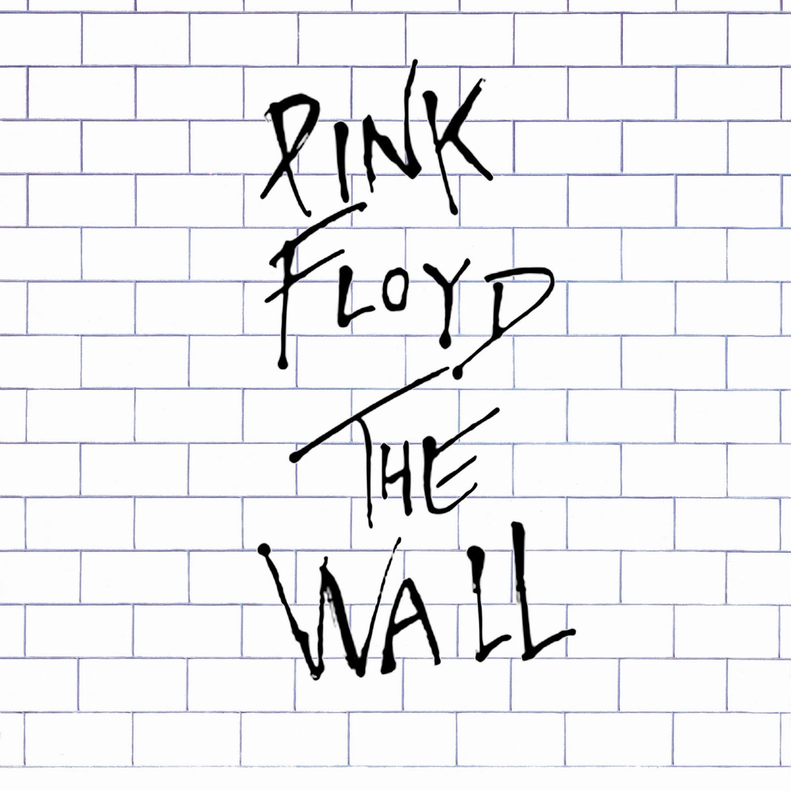
For many fans the album’s minimal front cover was the first artifact they saw from the visual medium that was The Wall. Waters’ suggestion was to simply draw a white wall on the front cover, nothing else. Scarfe remembers: “The cover didn’t take long. It’s just a grid, really. But we tried it in various different ways: there were dark black lines, there were soft grey line, big bricks, small bricks.” They wanted to keep the purity of that cover, but realized for commercial reasons that it was necessary to add the band and album name. The compromise was to add a separate piece of cellophane inside the shrink-wrap. That was the best part of the front cover, the splattering of ink that became the logo of that project for years to come. When you bought that double LP and opened the shrink-wrap, that piece of cellophane fell off, becoming a cherished sticker.
It may seem odd, but with all the wonderful drawings of characters inside the album, the part that I found most compelling and spent hours looking at was the lyrics. Part of it was the need to understand what the whole story was about, of course, but unlike most albums, the look of the lyrics had a very strong visual impact. Scrafe hand-wrote them using the same technique of dipping a nib inside black ink and letting the fluid work its magic on paper. It adds emotion inside the lyrics as you read them while listening to the music. This is what the hand-written lyrics look like for the brilliant third side, book-ended by Hey You and Comfortably Numb.

When asked what is his favorite part of The Wall, music and visuals combined, Scarfe pointed to the beginning of side two on the album: “My favorite piece from The Wall is Goodbye Blue Sky, which is a lyrical, poetic piece in which the drawings – the dove exploding into the German eagle which in turn changes into a kind of warlord – evolved very much from my own memories and feelings.” The imagery of the pieces falling off the British flag to reveal a cross is brilliant.
The collaboration between Roger Waters and Gerald Scarfe continued well beyond the work on the album. The next steps were the animations and giant puppets for the live shows, and finally the movie. Such a lasting partnership can only work with mutual admiration to each other’s talents. Scarfe summarized it well when talking about Roger Waters: “In many ways I regarded Roger as a kindred spirit. We seemed to share the same healthy, mused cynicism. He was also extremely respectful of my work. He remarked to me once that when you employ an artist to work for you, you don’t tell him what to do. You employ him precisely because you approve of his vision and because you have faith in it. Roger aided and abetted and encouraged me, but he never disagreed with what I was doing. It was wonderful, really, because he let me loose, which is the only way I like to work.”

If you enjoyed reading this article, you may also like these about the art of the album cover:
Leave a Reply